Oak River Retreat Center
Non-Profit Logo
Acts 2 Communities

Non-Profit Logo
Acts 2 Communities seek to build authentic Christian fellowship, where individuals gather at homes to immerse themselves in the transformative rhythms of faith. Centered around the teachings and Lordship of Jesus and empowered by the presence of the Holy Spirit, these communities engage in nine core rhythms: teaching, fellowship, breaking bread, prayer, healing, generosity, gratitude, worship, and invitation. To visually encapsulate this vision, PixelGraphics designed a logo that symbolizes the essence of Acts 2 Communities. Our primary aim was to create a brand identity that is clean, simple, and recognizable, placing a focus on the communal bond shared within the intimate setting of home gatherings.
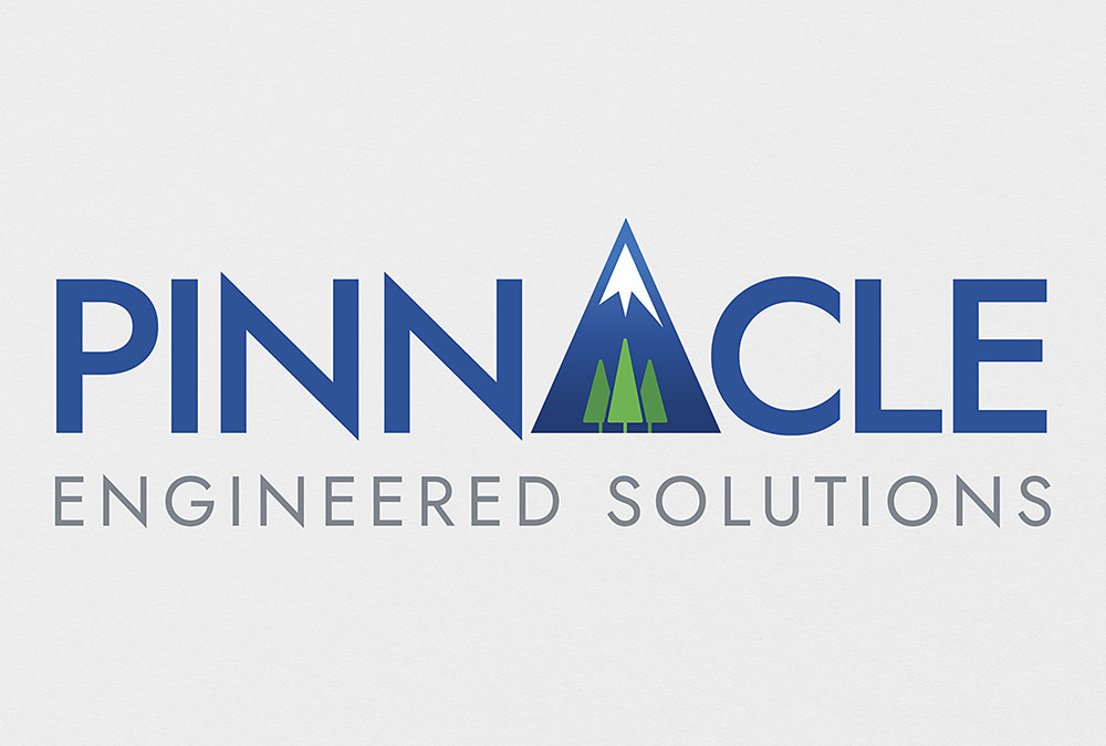
Pinnacle Engineered Solutions
Corporate Logo
Pinnacle Engineered Solutions needed an updated logo to enhance and position its brand for continued growth. Their current logo was essentially a bad piece of clip art with their name underneath. The owner described it as “Kindergarten clip art”. We incorporated the elements the client wanted, including a mountain peak and pine trees since their office was in Colorado Springs. We designed a clean, elegant solution using simplified elements and typography to mirror sharp, pointy graphics. The client was very pleased with the result.
Tennessee Motorcoach Association
Association Logo
The Tennessee Motor Coach Association has been working for the good of the Tennessee motor coach operators since 1995 and needed a new logo to accurately represent their brand to their membership and the motor coach industry at large. We felt it was important to reflect the industry while identifying the state membership in our new design. We incorporated a more modern-looking coach as well as the state flag colors and 3-star circle that is part of Tennessee’s state flag. The new logo presents a clean, forward-moving image of an association that is leading the way for it’s membership. The new logo has been very well received in the industry.
Virginia Motorcoach Association
Association Logo
Established in 1923, the Virginia Motorcoach Association is the trade association that represents Virginia’s motorcoach operators, travel planners and trade partners in matters at the state level. Their logo was outdated and didn’t accurately reflect the vision and brand of the association. They were wanting to keep elements of the original logo, such as the shape of their state, so we simplified the look and created a more dynamic and professional design that represents their membership more favorably to the motorcoach industry. The new design has been very well received and implemented in all their current marketing materials.
Baker Equipment & Supply
Corporate Identity & Branding
Baker Equipment & Supply provides equipment and supplies for the car wash industry and was needing a complete rebranding. Previously, they just had a capital “B” from the font Blippo as their logo. It was very outdated and also didn’t say anything about their company. They wanted to use their name so that the logo would reinforce name recognition. They also wanted the logo to suggest what their business was about. Our solution was to use a bold font and replace the letter “A” in “BAKER” with a simple illustration of a car getting rinsed from above with streams of water. They were very pleased with our solution and asked us to also design their catalog, business cards, letterhead, envelopes, trade show display, and some graphics used at the car wash facilities.
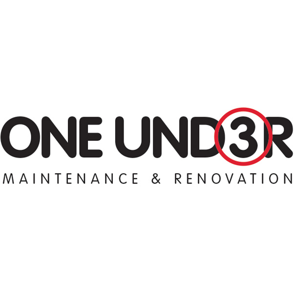
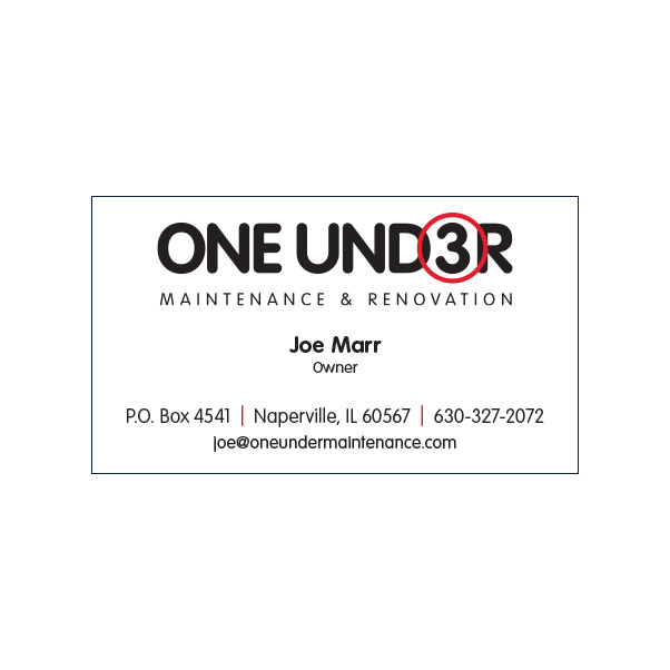
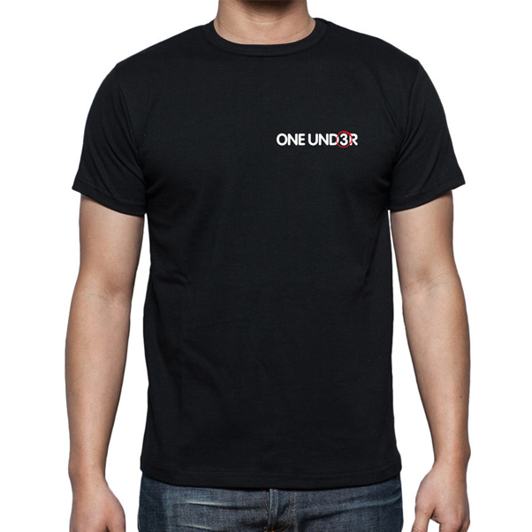
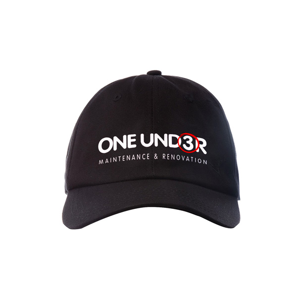
One Under Maintenance & Renovation
Corporate Identity & Branding
One Under is a company that specializes in renovation and maintenance of golf course facilities. They needed a complete corporate branding from scratch. We designed a simple, yet elegant solution that resonates with anyone familiar with golf working in the golf industry. A “birdie” is when someone scores one under par. Probably the most common birdie is on a par four hole, so your score would be a “3”. The way you indicate a birdie on your scorecard is by circling the number. We used this information familiar to golfers to create a memorable logo by substituting the “E” in the word “Under” with a circled “3”. Those in the golf industry instantly recognize that the circled “3” means one under, thus creating an immediate connection between potential clients and One Under. The One Under mark is also ideal for merchandising and marketing the One Under brand. We designed the logo, stationery, apparel, marketing collateral, and website (which is still under construction).
Cougar Industrial Supplies
Corporate Logo
We designed this logo for use on all their marketing material, packaging, and website. We created a simple, elegant solution by using the negative space of the cougar head to create a Capital C standing for Cougar. We designed and produced their product catalog and website as well.
Motor Coach Industries
![]()
Corporate Logo
MCI’s previous logo, the metallic “M”, was designed as part of a comprehensive overhall to their corporate branding strategy and affected nearly every sphere of the company including the metal ornament that is placed on the front of their motor coaches. Over the years however, it’s limitations became apparent when used in certain applications. It didn’t stand out on a white background and wasn’t strong enough on a solid color background. MCI had just come out of a financial reorganization and felt it was a good time to present an updated image. PixelGraphics’ solution was to take the “M” graphic, which had become well-known in the industry, and make it white instead of metallic silver. And, most importantly, surround it with a glossy, clean, 3D blue oval. This solution gave them much more visibility in the marketplace while building on the brand that was already established.
CNG logo
Motor Coach Industries needed a logo to indicate on marketing materials which coaches were equipped to use Compressed Natural Gas (CNG). Using the industry-wide standard for CNG, the diamond shape, we created a metallic 3D logo that compliments many of MCI’s other similar logos like their Hybrid logo. Although CNG is a “green” feature of the coach, MCI’s other eco logos already used green as a primary color, so we used blue to suggest the blue flame of natural gas.
![]()
80th Anniversary logo
Motor Coach Industries needed a logo to commemorate their company’s 80th anniversary. They wanted a logo that would go well with their new corporate logo, so we used the same blue color and steel chrome effect as their corporate logo. This logo was used throughout their advertising and marketing materials to bring attention to their 80th year in business.
Lumens Flashlights
Corporate Logo
PixelGraphics designed the logo, website, and catalog for this flashlight distribution startup. The challenge was to create a logo that conveyed instantly what the company was about. To show light—bright light—we needed to have a black background. Also the light needed to be a bright blue-white light instead of a dull yellow light since these flashlights were very bright and powerful. The client was very satisfied and his company has continued to grow.
![]()
Baseball Classics
![]()
Corporate Logo
Baseball Classics is an online company that sells a realistic Baseball card game. They wanted to upgrade their image and develop materials for the retail market. We started by designing this logo. We wanted to create a fun, iconic logo that had that “baseball feel” to it. The client loved it. We then designed a brochure, gameboard, playing cards, and retail game box to match the new brand.
Investortools
Product icons
Investortools needed to update and upgrade their branding for their various investment products. Part of that branding included designing icons for each product line. We then used those icons to create new brochures. To compliment the new branding strategy, the icons will also be implemented on their website and all other marketing collateral. In addition to the icons, each product has its own color.


Investortools
Corporate Logo
Investortools was looking for an updated corporate identity that reflected their innovative and respected product offerings. they wanted a logo that worked well in a variety of applications including social media and internet applications. We designed a mark that allowed use of a favicon for internet and social media use as well as made a bold statement in print applications. It’s bold italic font suggests forward thinking, innovative strategy—always looking to improve. The “Circle In” is used as their favicon to bring consistency to all media applications. The new identity is used on all print and online applications as well as product applications.
Educational Services for America
Corporate Logo
ESA (Educational Services for America) is a not-for-profit organization that provides books, CD-ROMS, curriculum, and Webcasts absolutely free to libraries and schools. We designed a logo that incorporates both the educational and patriotic nature of the company. We also designed their brochure, website, and other marketing collateral.
![]()
Golden Rule Consulting Services
![]()
Corporate Logo
Golde Rule Consulting Services provides practical consulting services for senior care & housing providers to refine their sales & marketing programs for greater outcomes.They accomplish this through program development, skills training, custom marketing plans, and strategies to increase sales. This was a startup and needed corporate ID, stationery, brochures, and flyers.
Caring for Kids
![]()
Non-profit Ministry Logo
Caring for Kids is a non-profit mercy ministry of ALN (A Light to the Nations). Their primary focus is helping children in the Puerto Vallarta region of Mexico. Because their main focus is helping children, we wanted to give it a playful, energetic look. The heart has a hand-drawn quality to it, as if drawn with a marker by kids. The colors are bright and festive to reflect the culture of Mexico and the positive impact Caring for Kids has on the Puerto Vallarta community. We also designed their website for them.
Growing Marriages
Church Ministry Logo
Growing Marriages is a church ministry that helps couples to prepare for, enrich, and repair their marriages. We also designed the website for Growing Marriages.

Big Bash Restaurants
![]()
Corporate Logo
PixelGraphics designed the logo for this startup restaurant group. This is the corporate holding company that owns and manages a group of restaurants. The logo needed to look more “corporate” and yet suggest the food industry. Big Bash would focus more on event planning and management while the individual restaurants in their group would focus on retail food service.
Big Fish Grille
Restaurant Branding
PixelGraphics designed the logo for this restaurant, one of the restaurants in the Big Bash group, that is used on signage, menus, stationery, and other marketing collateral.
![]()
Partners in Print & Premiums Plus
Corporate Logos
These logos were designed for two companies that had the same owner. The companies worked together and needed to have a similar feel even though they were different companies. We also did the brochures, stationery, and vehicle graphics.
BP Sealcoating
Company Logo
This startup needed some striking imagery that would launch their company and set them apart in their marketplace. PixelGraphics gave them a look not seen by any of their competitors. We also carried the brand through in the design of their Postcard mailers, truck signage, and website. Their website consistently comes up in the top ten on Google for their search keywords.
![]()